Unearthing Air ↗
Website, Creative Coding, Data Visualization, 2025
Website, Creative Coding, Data Visualization, 2025
Website, Creative Coding, 2025
Brand Identity, Website, Generative Design, 2025
, the brand and website offer a dynamic introduction to these new voices, while creating a vibrant platform for the gallery to showcase fresh art, spark conversations, and host innovative ideas.
Breaking away from the typical art gallery website, GOCA's web experience brings the focus on art and artists to life. With vibrant animations at its core, the site feels alive and constantly evolving. The shapes drawn from the logomark animate with purpose, forming shifting patterns over time. Features like current exhibits, artist stories, and highlighted pieces come together to tell the gallery’s story with clarity and vivid detail.](/goca/img2.jpg)
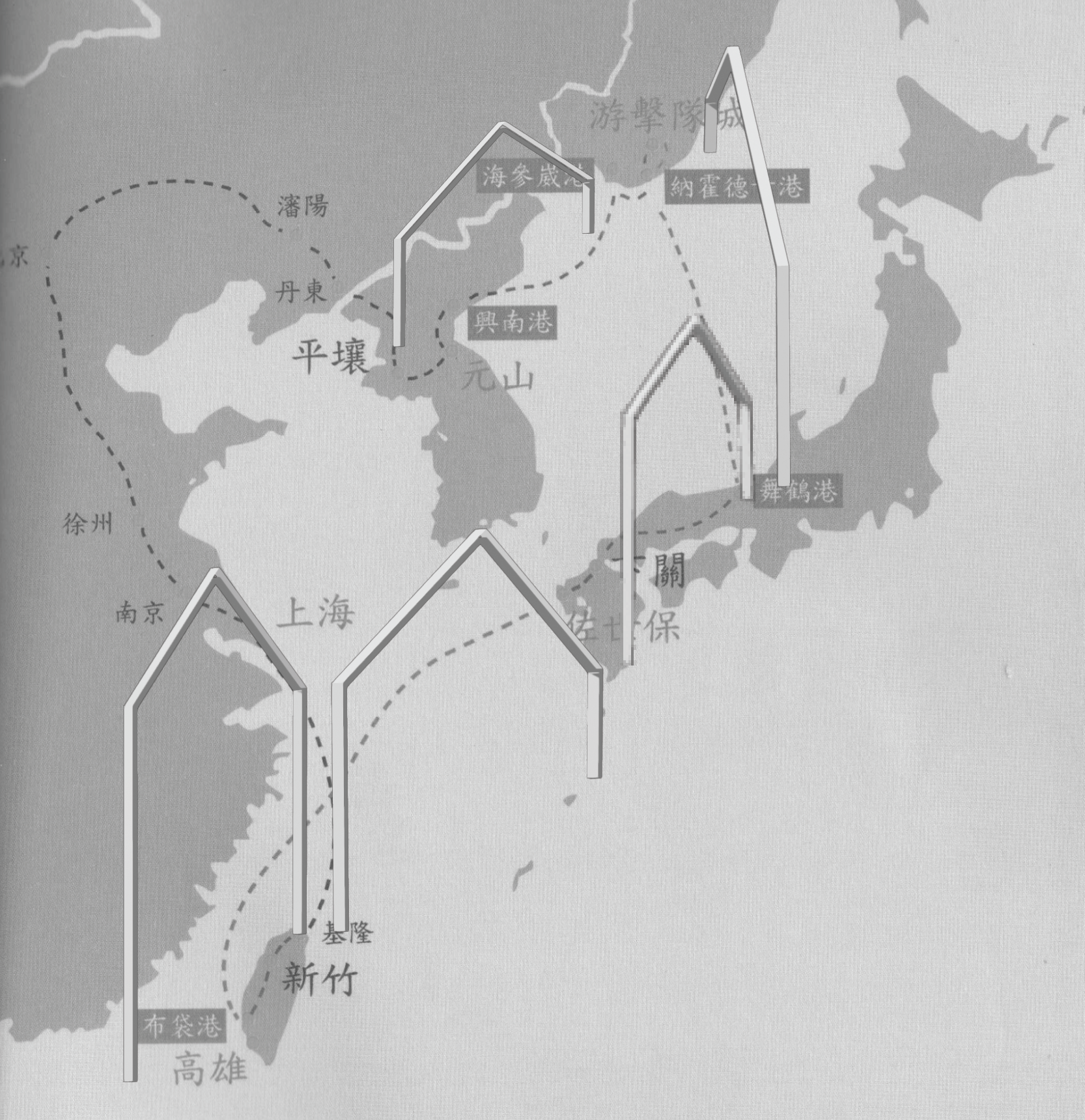
Research, Installation, 2024
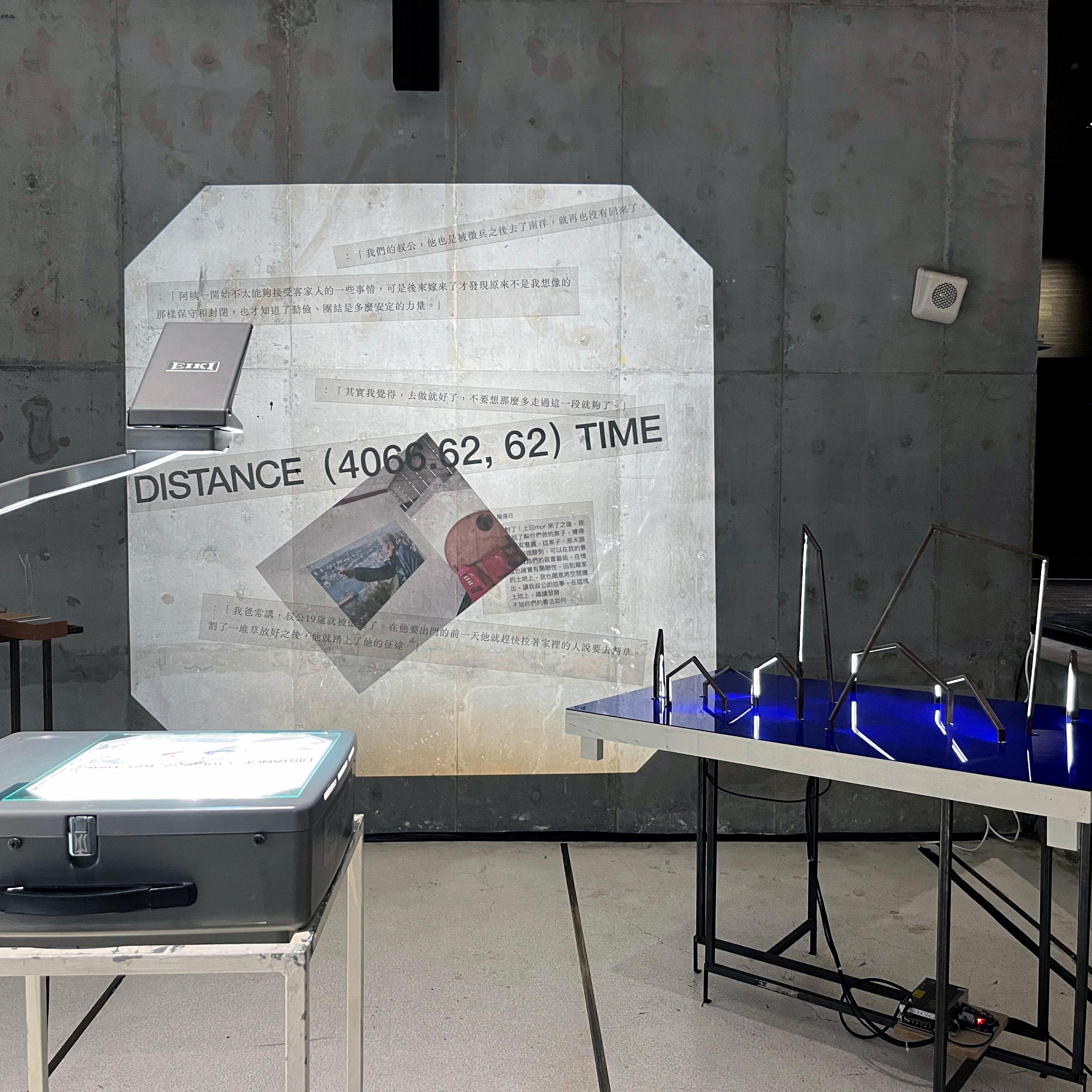
Installation, 2024
Brand Identity, Generative Design, Tool, 2024
Website, 2023 — 2024
Data Visualization, Generative Design, Website, 2023 — 2024
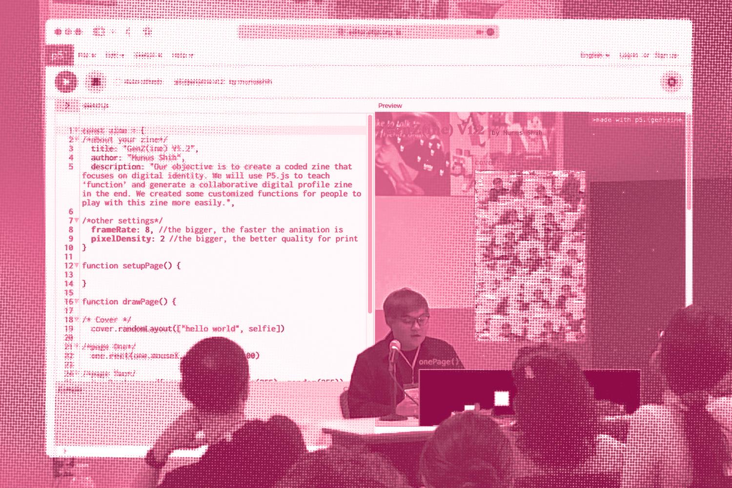
Zine, Javascript Library, 2023 — 2024
A free and user-friendly javascript library for anyone who’s curious about forking, remixing, and collaborative zine-making.
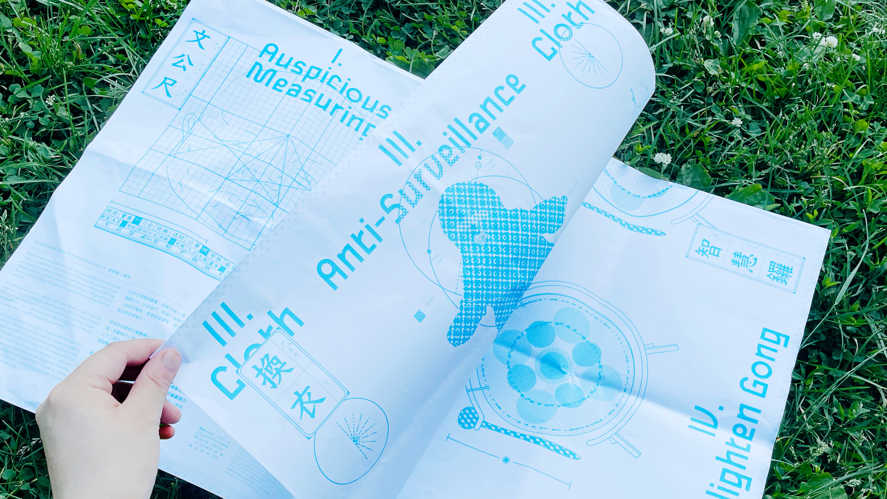
Zine, 2023
A speculative design project that remixes the current western referendum voting process with ZhuaZhou and many other Taiwanese traditions.
.jpg)
Organizing, 2023
This class site serves as a hub for the materials and resources I curated for the class at Parsons Communication Design.
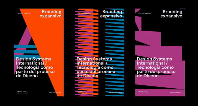
Brand Idneity, Generative Design, 2023
A generative rebrand of the the Chile design digital platform’s social media page made at Design Systems International.
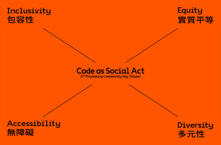
Organizing, 2023
Co-organized with my Taiwanese collective SpOnAcT!, PCD Taiwan 2023 titled "Code As Acts" is an exploration of how creative programming can engage with society and intersect with various disciplines. The event also highlights past and ongoing efforts by both local and international communities in this field.
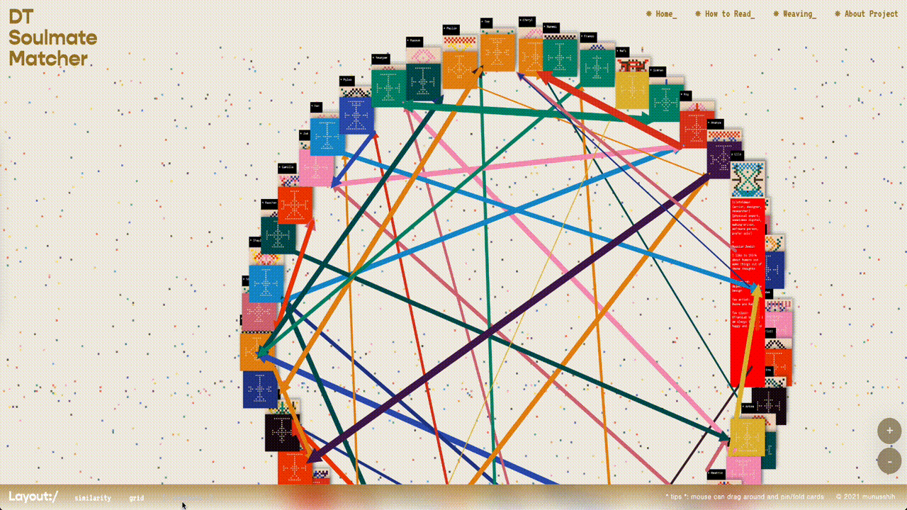
Data Visualization, Generative Design, Website, 2023
By collecting data from 45 community members, a custom algorithm was developed to experiment with a new way of facilitating community building through generative design.
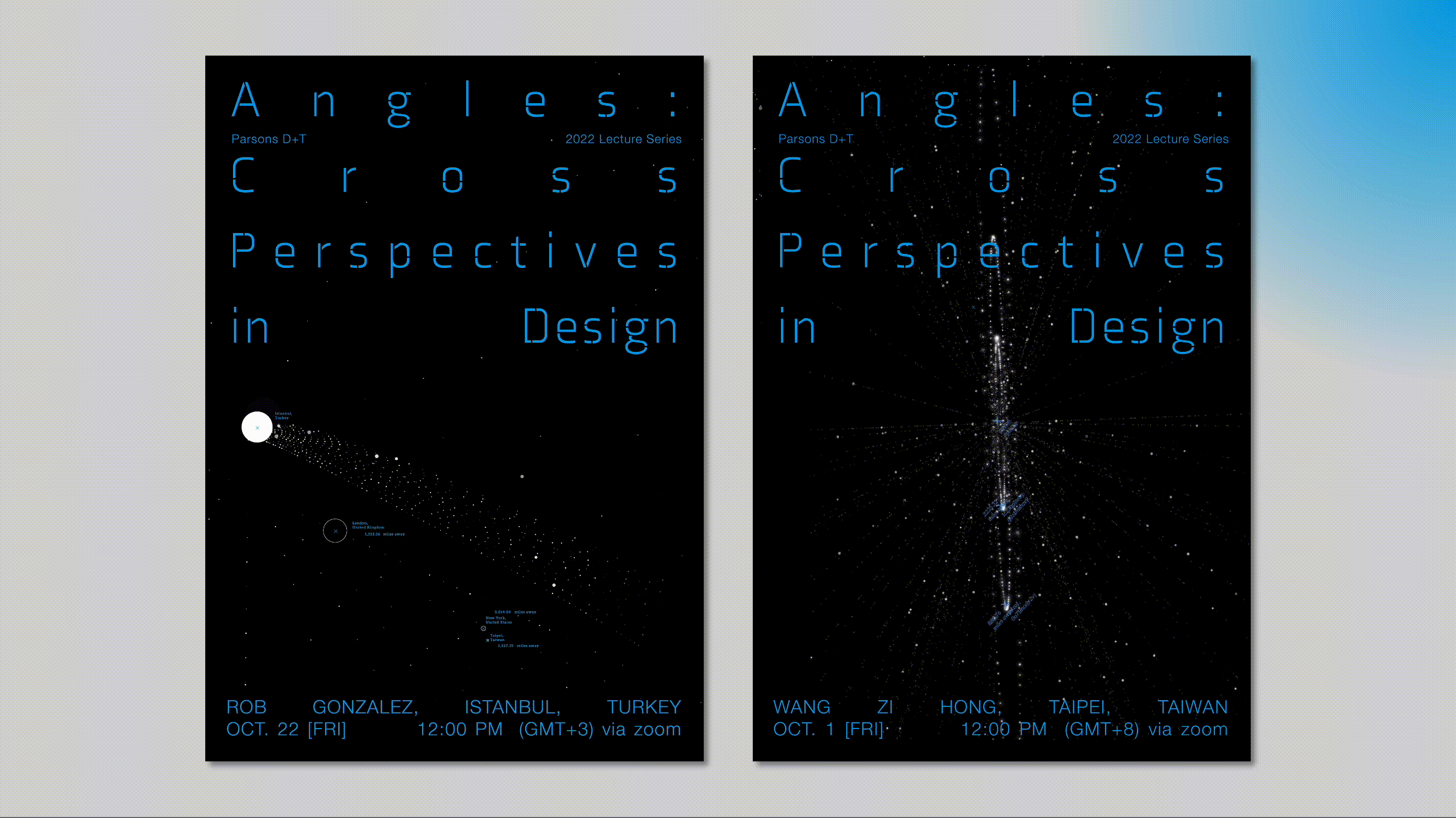
Data Visualization, Poster, Tool, 2022
An algorithmic and interactive poster campaign for an online global design lecture series.
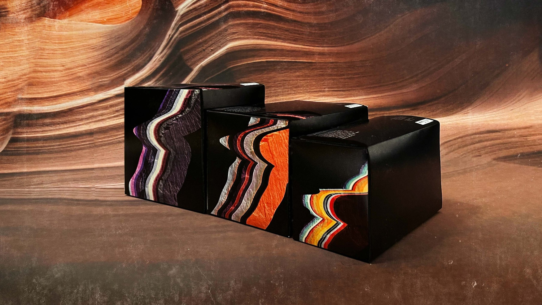
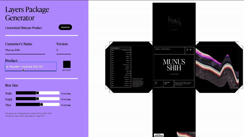
Packaging, Generative Design, Tool, 2022
Drawing from the visual vernacular of both soil layers and skin layers, each box pattern is uniquely generated based on the customer’s personalized formula.
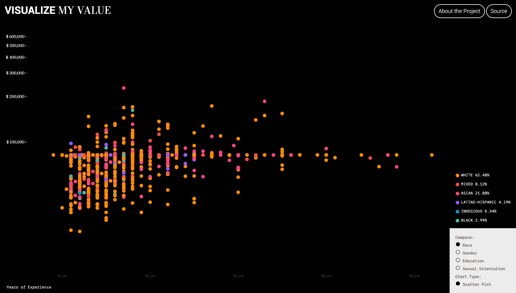
Data Visualization, Website, 2021
What determines your salary? Your experience, gender, education, sexual orientation or race? This project visualizes AIGA anonymous Graphic Design Salary Transparency spreadsheet.